We can't find the internet
Attempting to reconnect
Something went wrong!
Hang in there while we get back on track
Phoenixでは現在、以下のように Heroicons を CoreComponents.icon component にデフォルトで連携して提供しています。
defmodule MyApp.CoreComponents do
  @doc """
  Renders a [Heroicon](https://heroicons.com).

  ...

  ## Examples

      <.icon name="hero-x-mark-solid" />
      <.icon name="hero-arrow-path" class="ml-1 w-3 h-3 animate-spin" />
  """
  attr :name, :string, required: true
  attr :class, :string, default: nil

  def icon(%{name: "hero-" <> _} = assigns) do
    ~H"""
    <span class={[@name, @class]} />
    """
  end
end
HeroiconsはTailwind Labsが直接作ったアイコンライブラリなので期待していましたが、まだ足りないアイコンが多く、2024-11-18のv2.2.0以降は新しい更新がなく、実質的に放置されたプロジェクトに見えます。
これを補うために、Sidekickicons のようにHeroiconsスタイルのアイコンを追加したプロジェクトもありますが、なかなか活発にはなりにくいようです。
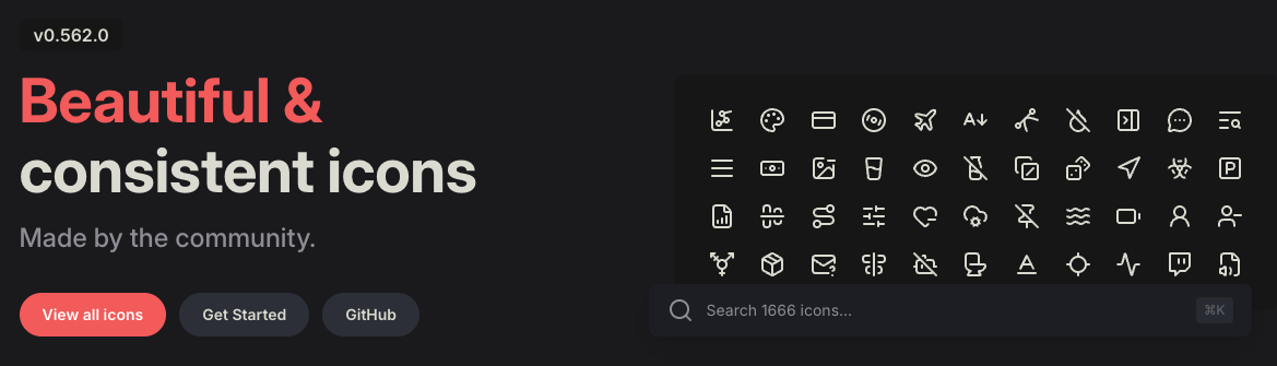
そこで、アイコン数が多く継続的に更新されている Lucide をPhoenixで使えるようにしてみました。
PhoenixでLucideを使う設定
mix depsを追加
Heroiconsがtailwindlabs/heroiconsのGitHubリポジトリからoptimizedフォルダの内容だけを取得するように設定されているのと同様に、Lucideもiconsフォルダの内容だけを取得するよう、mix.exsのdeps/0に以下を追加します。
defmodule MyApp.MixProject do
  ...

  defp deps do
    [
      ...,
      {
        :lucide,
        github: "lucide-icons/lucide",
        tag: "0.562.0",
        sparse: "icons",
        app: false,
        compile: false,
        depth: 1
      }
    ]
  end
end
lucide.js を作成
Phoenixがデフォルトで提供する heroicons.js を参考に、./assets/vendor/ に lucide.js も作成します。
Heroiconsはoutline/solid/mini/microの4種類に対してTailwind CSSの動的ユーティリティクラスを生成するため少し複雑ですが、Lucideはもっとシンプルです。さらにLucideに合わせてmask-sizeの設定を追加しました。
const plugin = require("tailwindcss/plugin")
const fs = require("fs")
const path = require("path")

module.exports = plugin(function ({ matchComponents, theme }) {
  let iconsDir = path.join(__dirname, "../../deps/lucide/icons")
  let values = {}

  fs.readdirSync(iconsDir).forEach(file => {
    if (file.endsWith(".svg")) {
      let name = path.basename(file, ".svg")
      values[name] = { name, fullPath: path.join(iconsDir, file) }
    }
  })

  matchComponents({
    "lucide": ({ name, fullPath }) => {
      let content = fs.readFileSync(fullPath).toString().replace(/\r?\n|\r/g, "")
      content = encodeURIComponent(content)
      let size = theme("spacing.6")

      return {
        [`--lucide-${name}`]: `url('data:image/svg+xml;utf8,${content}')`,
        "-webkit-mask": `var(--lucide-${name})`,
        "mask": `var(--lucide-${name})`,
        "mask-size": "contain",
        "mask-repeat": "no-repeat",
        "background-color": "currentColor",
        "vertical-align": "middle",
        "display": "inline-block",
        "width": size,
        "height": size
      }
    }
  }, { values })
})
app.css を変更
ここまで作成したLucideプラグインをTailwind CSSに登録するため、app.css に以下を追加します。
@plugin "../vendor/lucide";
CoreComponents.icon component に "lucide" prefix を追加
既存の CoreComponents.icon component は"hero" prefixしか使えません。
以下のように"lucide" prefixも使えるように追加します。
defmodule MyApp.CoreComponents do
  ...

  attr :name, :string, required: true
  attr :class, :string, default: nil

  def icon(%{name: "hero-" <> _} = assigns) do
    ~H"""
    <span class={[@name, @class]} />
    """
  end

  # lucide prefixを使えるように追加
  def icon(%{name: "lucide-" <> _} = assigns) do
    ~H"""
    <span class={[@name, @class]} />
    """
  end
end
Lucideを使う
このように追加したLucideアイコンは、これまでHeroiconsを使っていたのと同じくらい簡単に使えます。
<.icon name="lucide-newspaper" />
実際にこのサイトにLucideを適用した全コードはこちらで確認できます。
これでアイコン不足から解放され、Lucideの大量のアイコンを使えるようになりました。Lucideのアイコンは今後も速いペースで増えていくので、必要に応じて定期的にLucideのバージョンを更新して使ってください。